Problem
This challenge was part of the recruitment process for LavaLab at USC, with a timeline of only one day. We were tasked with improving or adding a new feature to a music streaming platform of our choice. As an avid Spotify user—and surrounded by other Spotify users—I interviewed a few people about their homepages. A few quotes stood out and led to the following problem statement.
“I never listen to the Spotify-generated music.”
“I usually just go to my liked songs, but if I want to listen to something new I use Discover Weekly.”
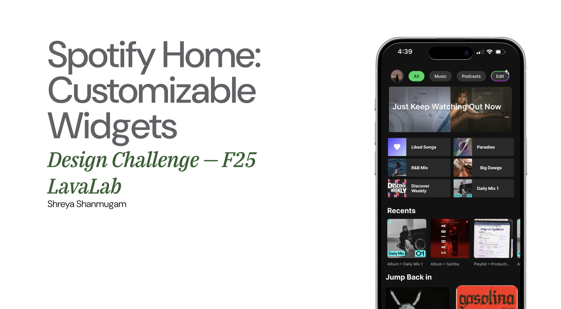
Spotify’s home page experience is largely static and algorithm-driven, limiting user control and personalization. Users often struggle to quickly access their preferred content because the interface emphasizes algorithmic recommendations over individual priorities. The current layout does not allow users to manage what appears “above the fold,” leading to excessive scrolling and frustration when locating desired music.
Key design decisions
What I prioritised
- Empower user control and personalization Introduce customisable sections on the home screen, allowing users to pin or reorder playlists and categories based on their preferences. This gives users a sense of ownership and relevance.
- Maintain familiarity The widget approach introduces flexibility and visual variety while staying coherent within Spotify’s design system. It lets users prioritise what matters most—similar to personalization on mobile OS dashboards.
- Quick, intuitive access without excessive scrolling By letting users customise what’s on their homepage, the solution aims to reduce excess scrolling and help people reach their favourites faster.
Process
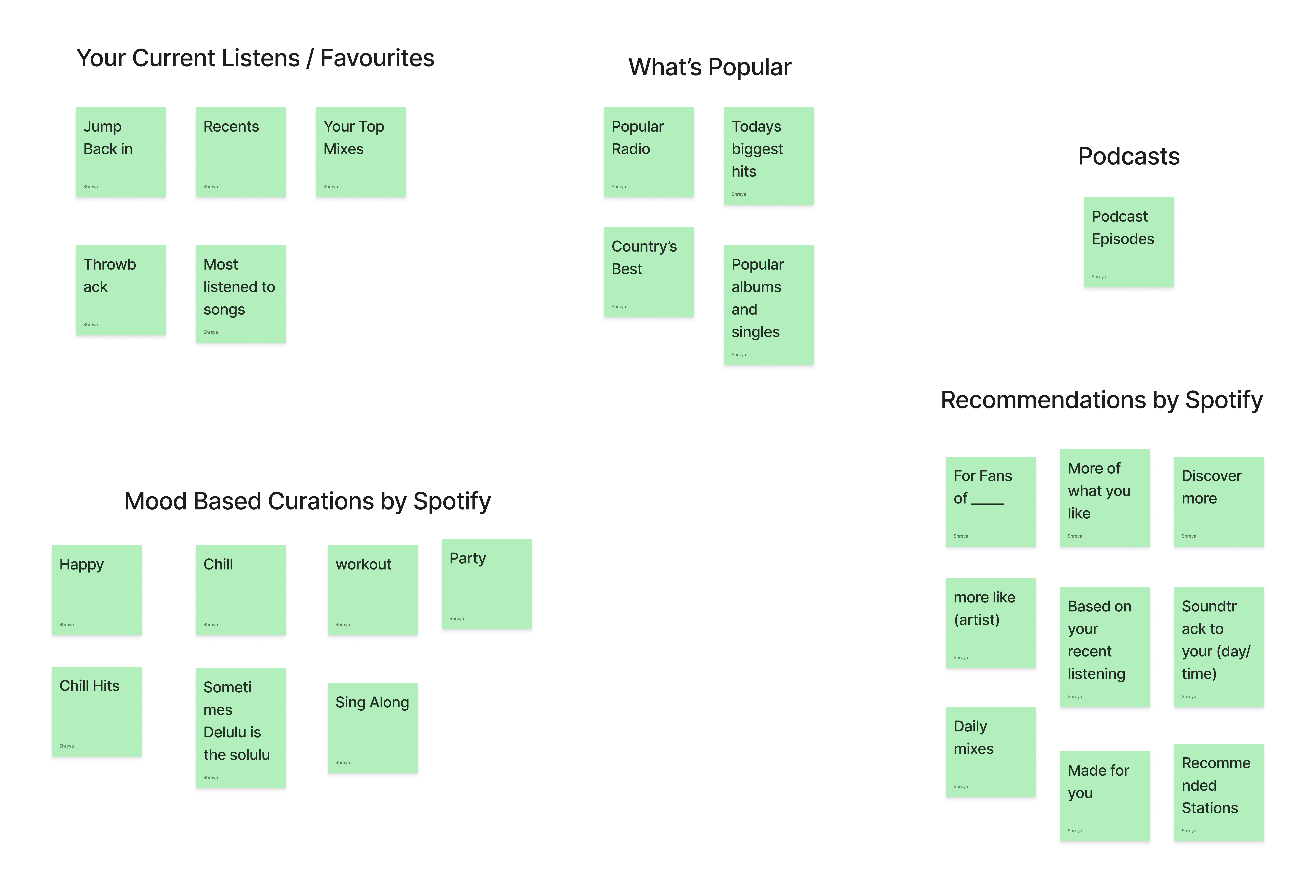
Affinity mapping
I began by studying existing homepages and realised that the algorithm varies between people and changes every day—from the order to the playlists, you get a different version of your homepage every day. I collected data on playlists I could find across multiple accounts, grouped them into classifications, and iterated until I landed on a stable map of section types.
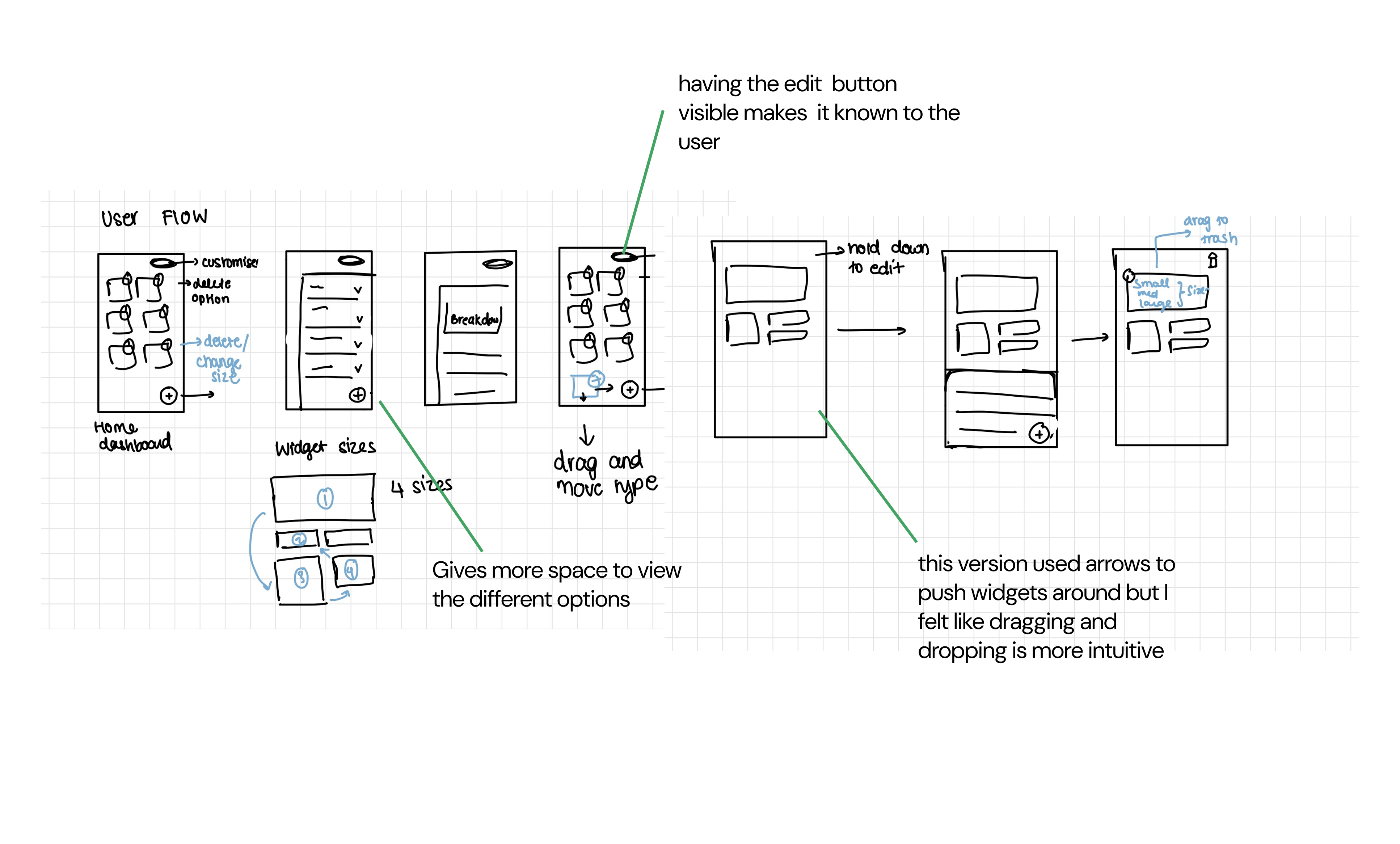
Low-fidelity wireframes
I explored several layout directions in low fidelity—how widgets could sit in a grid, how edit mode might enter from the profile or header, and how resizing could work without breaking Spotify’s visual rhythm. Those explorations fed mid-fidelity screens focused on clarity, touch targets, and a predictable edit flow before moving to the final solution.
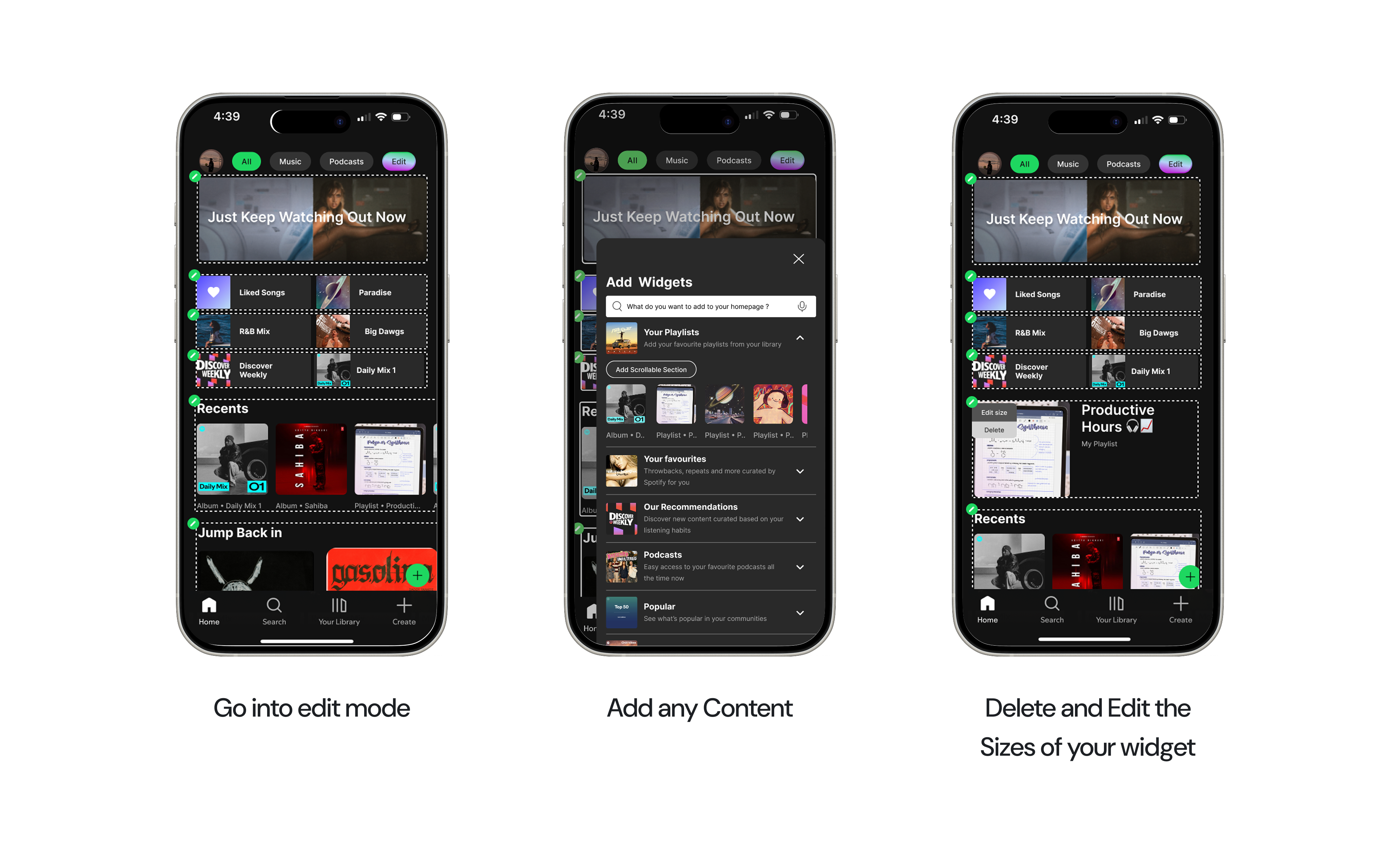
Solution
The final concept centres on a simple loop:
- Go into edit mode to rearrange the homepage.
- Add any content you want surfaced first.
- Delete and resize widgets so the fold reflects your priorities—not only the algorithm’s.
Key takeaways
Accessibility considerations
Moving forward, I'd aim to give more attention to accessibility needs - ensuring that text, color contrast, and interactions are inclusive for all users. This involves testing with accessibility tools and designing for assistive technologies to create a more equitable experience for everyone.
Problem validation and usability testing
During my interview with this case a large question that came up was 'Do users really want this feature? or is it extra work for them?' Thus if I did this challenge again I would Conduct more in-depth user interviews and usability tests to validate the core problem and measure the effectiveness of my solutions. This would help confirm that the challenges I identified truly reflect user needs and ensure that the redesign aligns closely with real behaviors and expectations.
Integration and product cohesion
In a conservative, regulated space, how you explain the product is as important as what it does. Midway through the project, we revisited our branding and positioning—and saw an immediate shift in how people reacted. Clearer language, consistent visual motifs, and a more restrained tone made the product feel more credible, easier to understand.
More case studies